WordPress: wrap columns so that the right one gets on top on mobile devices

Normally WP will wrap the columns after a manner where the right one goes to the bottom om mobile devices. Here is a recipe:

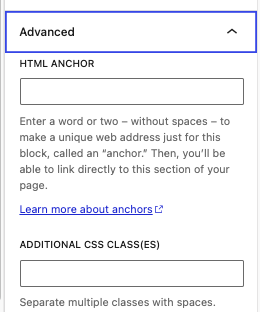
Add a class to your column block

In additional classes add your class. In this case I added: petjReverse as my class.

style.css

Then add the this to your style.css:

/* Mobile, Tablet */
@media only screen and (max-width: 783px) {

   /* will stack reversed */
   .petjReverse {
	   flex-wrap: wrap-reverse !important;
   }
	
}

Save and update. If need be clear the cache in WordPress and your browser. That’s it.


Comments

Leave a Reply

Your email address will not be published. Required fields are marked *

This site uses Akismet to reduce spam. Learn how your comment data is processed.

Enable Notifications OK No thanks

We use cookies - more information

Multimusen.dk will set a few cookies from Doubleclick, Google and the Social Media plugins they ay set some cookies. Some of my pages use APIs - such as YouTube, LinkedIn, Google Fonts, Google Maps, Mapbox, Spotify, Jetpack, Twitter, Facebook &c.. Such plugins may set the odd cookie.

Close