A while after your theme has been installed, you should inspect how the theme behaves on different devices. Problably the theme needs at least some responsive adjustments.
Tweak Flexbox
When you edit the theme files you can add responsive styles to the style.css or a CSS made via a plugin, like these:
@media only screen and (max-width: 600px) {
	/**
	* Add the class noFlex to a group
        * or row that should not flex
        * on smaller devices
	*/
	.noFlex {
		display: block !important;
	}
}
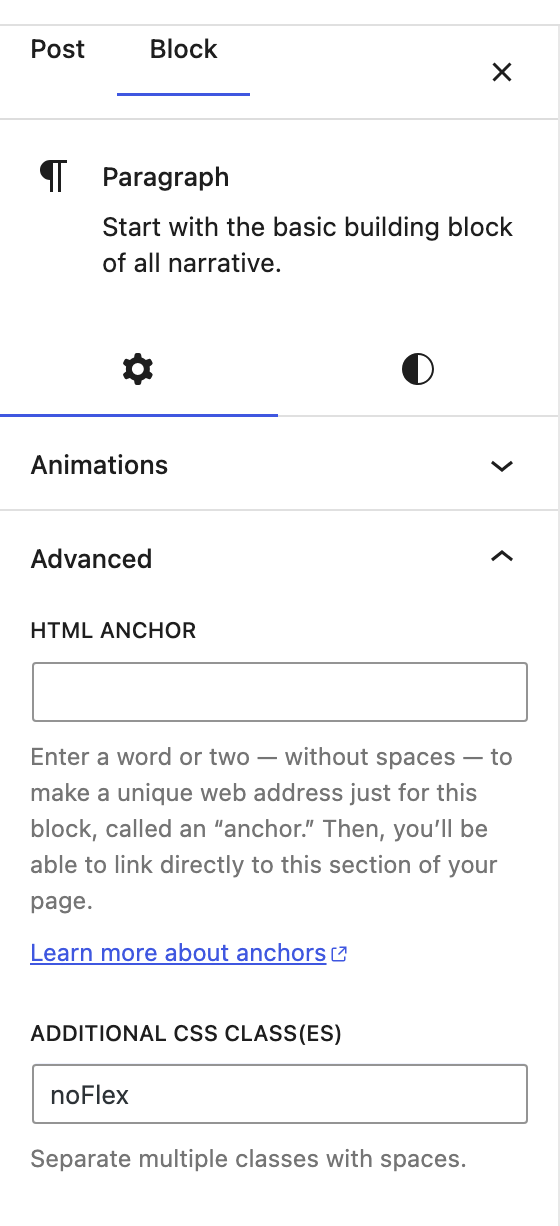
If you have say a row that displays flex on smaller devices, you can add the class noFlex in the Advanced field of the relevant block.

Important
If you edit the style.css of the theme directly inside wp_content/themes/yourTheme/style.css the code will not be saved in the theme.
In a case like this the best approach is to:
- Enable another theme
- Delete the theme
- Reinstall the theme with an updated style.css
- Activate the theme.
- Now the responsive rules will be part of the style.css
For unknown reasons WordPress does not export your changes if this is not done. I’m not sure whether this strange behavior is a bug or done deliberately.


Leave a Reply