A super fast spoken video. Get inspiration for your SASS studies in the video by Derek Banas.
30 SASS Videos
Here’re some 30 videos on SASS. Basicly it’s a good SASSsy course.
Per's Multimedia Tutorials
🇬🇧 English articles and tutorials.
A super fast spoken video. Get inspiration for your SASS studies in the video by Derek Banas.
30 SASS Videos
Here’re some 30 videos on SASS. Basicly it’s a good SASSsy course.
Here’s a recipe that works on Ubuntu & friends:
How to edit the /etc/apache2/envvars file
locate lines:
export APACHE_RUN_USER = www-data
export APACHE_RUN_GROUP= www-dataChange this to:
export APACHE_RUN_USER = yourName
export APACHE_RUN_GROUP= yourName
The username should be someone who can read, write and execute the files.

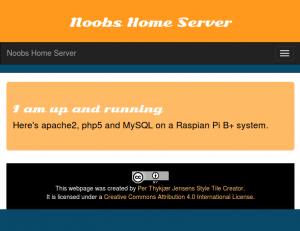
So this summer I’ll set up a Raspberry Pi webserver on my LAN. Since I have a fixed IP-address at home the RP should be able to work as my webserver. In due time that is. I bought the RPi with a very small SD card. All too soon it ran out of memory. I bought a 16 GB SD card and tried to install an os.
My first try was Raspian, since Debian is among my favorite distros. But the thing simply would not boot. Like at all. After several burnings, formats, gparteds and unetbootins I went for the nobrainer Noops.
After a format I copyed the files to the SD card. And … Abrahadabra … the Pi booted.
Nice.
Sometimes you just have to clean up the database. So today I tossed out more than 800 short notes. However most of them are available at Per’s Computer Cyprianus.
In this tutorial you will learn how to create a WordPress plugin that will get data from the WordPress database – or other tables residing in the same database.
As a starter here’s a video from the “Tips and Tricks HQ”. See the full blog post here. The tutorial will add a new tool in the Dashboard.
Rapid prototyping and responsive webdesign are the major trends at Future of Web Design, London 2015. Pixelperfect designs in Photoshop are sooo dead. Design in the browser is the new kid in town.
The workshops are interesting because they give you:
I attended Steve Fisher’s workshop on content strategies, and learned a lot. During the first part of the workshop Steve Fisher introduced his workflow. Then we had to try it out in groups.
With the responsive web new content strategies are needed. Several speakers focussed on the topic. ??? of the Guardian told about the redesign of the paper.
It was a story about failing, analysing and hard work before they found a formula. Perhaps not a silver bullet. But it works for the time being.
Of course designing in the browser will affect the workflow of the designer. In stead of painting his vision in Photoshop, the designer must work with code.
And the designer must test the production on several devices. Since there are litterally thousands of resolutions and screen sizes knowledge of libraries is important.
Perhaps code is not the first thing that comes to a designer’s mind. But as the designer from Envision said:
“It is not harder to learn code than to learn to use the graphical interface of Photoshop.”
At an early stage the designer will be able to test the production on real devices with the real target audience and the costumers.
More than one speaker stressed on working with real content in order to get the tone and voice of the product.
Of course Photoshop is not entirely dead. You still need a tool for image manipulation.
Den Odell gave a very fine introduction to the future standards of HTML and CSS.
Christiano Betta introduced several libraries and validationg methods for credit card forms.
Even though most developers work with some kind of rapid prototyping framework they did not talk much about their rapid prototyping frameworks. They were mostly mentioned en passant. I’d have loved to hear more about this subjects.
The focus was clearly on content strategy, wireframing by pen & paper. Most developers talked about rapid prototyping directly in the browser.
There are many advantages when you design in the browser. You see the result immediately. If something must change, you don’t have to redraw the layout in some three to four resolutions in Photoshop. And recode your markup or stylesheet. The new workflow seems to look somewhat like this:
A rapid prototype is build at the very beginning of a project. Gone and over are the days of pixel perfect wireframes in Photoshop, stated Billy Kiely
Now the entire design process is done via the browser. There are many advantages for the designer here. All design is an iterative process.
Design is all about designing interaction and storytelling.
The designer works with the interactive experience. Redesign must be easy – and with a keen focus on the story.
There are three stages or aspects of design:
Wireframes are fine tools for the storytelling. But viewing drafts in Photoshop is not the same thing as watching your work on the actual devices.
If you design page by page, you risk loosing the general picture of the whole story. Therefore it’s better to work on little pieces at a time, and fill in the gabs when you see them.
Investment is the enemy of design.
A sum up of Billy Kiely’s rapid prototyping workflow from the designer’s perspective:
Rapid prototyping and responsive webdesign are the major trends at Future of Web Design, London 2015. Pixelperfect designs in Photoshop are sooo dead. Design in the browser is the new kid in town.
The workshops are interesting because they give you:
I attended Steve Fisher’s workshop on content strategies, and learned a lot. During the first part of the workshop Steve Fisher introduced his workflow. Then we had to try it out in groups.
With the responsive web new content strategies are needed. Several speakers focussed on the topic. ??? of the Guardian told about the redesign of the paper.
It was a story about failing, analysing and hard work before they found a formula. Perhaps not a silver bullet. But it works for the time being.
Of course designing in the browser will affect the workflow of the designer. In stead of painting his vision in Photoshop, the designer must work with code.
And the designer must test the production on several devices. Since there are litterally thousands of resolutions and screen sizes knowledge of libraries is important.
Perhaps code is not the first thing that comes to a designer’s mind. But as the designer from Envision said:
"It is not harder to learn code than to learn to use the graphical interface of Photoshop."
At an early stage the designer will be able to test the production on real devices with the real target audience and the costumers.
More than one speaker stressed on working with real content in order to get the tone and voice of the product.
Of course Photoshop is not entirely dead. You still need a tool for image manipulation.
Den Odell gave a very fine introduction to the future standards of HTML and CSS.
Christiano Betta introduced several libraries and validationg methods for credit card forms.
Even though most developers work with some kind of rapid prototyping framework they did not talk much about their rapid prototyping frameworks. They were mostly mentioned en passant. I’d have loved to hear more about this subjects.
The focus was clearly on content strategy, wireframing by pen & paper. Most developers talked about rapid prototyping directly in the browser.
There are many advantages when you design in the browser. You see the result immediately. If something must change, you don’t have to redraw the layout in some three to four resolutions in Photoshop. And recode your markup or stylesheet. The new workflow seems to look somewhat like this:
What is the future perspectives for the HTML and CSS standards? At the Future of the Web conference Den Odell started with a definition for responsive web design, somewhat like this:
… the website appears to have been built for that particular device.
Odell talked about what is going to happen with HTML and CSS soon, in the future and the end goal of RWD.
The new specifications for HTML5.1 and CSS level 4 is in the near future. A great improvement is the pictures tag. Here a new attribute is srcset that will work in the img and picture tags.
<picture
    srcset="tiny.jpg 1x, larger.jpg 2x"
    src="myPicture.jpg"
    alt="Here is my picture" />
In the CSS you will be able to use the images according to media queries. And so you can have responsive images in a more elegant way.
But Odell states, that this is in the near future. By now some 52% of the web browsers support using pictures and images like that.
Here Odell presented ideas for media queries, for instance a webpage might look different from country to country or even from continent to continent. The CSS might look somewhat like this:
@media {
    continent: europe;
}
Perhaps the user acitity could be monitored. What if you’re jogging while on the webpage?
@media {
    activity: jog;
}
Connection speed is also an important factor, so perhaps you could address the problem thus:
@media {
    connection-speed: slow;
}For Odell the end goal is this: the browsers must disappear. So in conclusion Odell asumes, that the GUI will:
… apear to have been built for the user.
From the helicopter perspective Odell’s vision is a movement from a focus on devices to focus on the user.
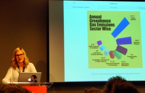
In this speak at the Future of Web Design, London 2015, we were introduced to basic concepts of data visualisation.

The first picture we saw were some faces. The faces were connected to a database about crime statistics in the USA. The data were connected to facial parts, such as the forehead, the eyes, the mouth etc. The higher the number the bigger was the facial part.
A face with a very big forehead might indicate a high murder rate. The look of the face would tell an interestiong story about crimes the states in the USA.
Here the fun began. Lisa Gringl informed us, that a pie chart always shoul ad up to 100%. The blunder samples were just amazing.
Then she said: “Never use 3d”. We saw some horrible examples of 3d visualisations. Again the blunders were funny and useless.
As an example of a well designed animation with data visualisation Lisa Gringl introduced winds in the USA. You could follow the weather all over the USA. The visualisation is quite impressive.
In conclusion Lisa Gringl mentioned some of the tools of the data visualizier. Pen and paper are still going strong. So is Illustrator and even spreadsheets. The visualisations should ideally:
Apart from pen and paper Lisa Gringl recommended the
Here I would have loved to se a code sample from real life. In fact that was the only thing I missed in this talk: an introduction to the code behind an interactive data visualisation.
On Twitter Lisa Gringl recommended to have a look at the d3.js. Here you find a JavaScript library for data visualisation, and the code behind the creative work:

At the Future of Web Design, London 2015, content strategist Steve Fisher presented his model for content design.
At the Future of Web Design, London 2015, content strategist Steve Fisher presented his model for content design. Fisher introduced a two step model. But first he introduced four question for every website:
His content design principles are:
Fisher wants to work for a real audience. That’s perhaps why he does’nt like personas. He prefers to have a real audience and to talk to real persons. Developers can asume many things, when they work with personas. Only interviews with the real audience will say whether these assumptions are correct or not.
The design funnel should look like this:
First of all you have to prioritize the content. Some issues may be urgent important or non-urgent important. Others may be “urgent non-important” or even “non-urgent non-important”.
Then all you must define central content. Everything on the website must be prioritized. Hay recommends to sketch out all pieces of content in order to discover the core message of the website.
Whether the screen is small or large you have to figure the patterns.
One way to prioritize is to create a spreadsheet and then prioritize. You need some sort of content inventory – and stick it notes can be great tools for the job. Here you have to look for patterns.
When the lists are done, they should be prioritized by importance e.g.:
That a homepage may come in as the 5th priority may come as a surprise. But of course it depends on the website. You have to prioritize by importance, because the users may come to the landing page before the homepage.
Another way to prioritize is to work with the views. Here you write a list with all your views, and then prioritize like this:
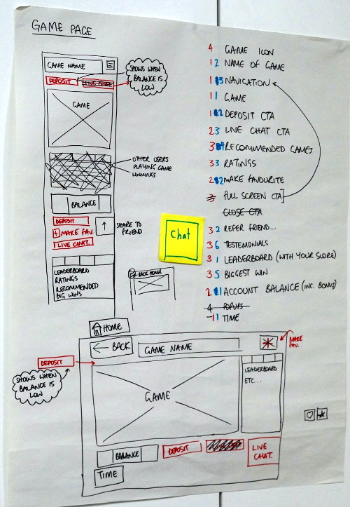
That was the starting point of the workshop. In groups we had to find a case. In our group we used an online casino as our case.
We looked at the different views, and worked in two steps. First we put the views in the categories one, two, three and four. After that we had to prioritise the ones, the twos and so forth.
Having sorted the information on the website we created two essential wireframes. One for mobile devices and another for larger devices.
After the group presentations Steve Fisher gave some valuable tips for websites for responsive testing:
Steve Fishers workshop was a fine introduction to content strategy. In the group we worked with a real life case about an international web casino. In the end the workshop gave some fine inputs, tools and tips about structuring content.
TEDxRedDeer – Steve Fisher – What Can We Learn From Open Source.
URL: Hello Fisher.
We use cookies - more information
Multimusen.dk will set a few cookies from Doubleclick, Google and the Social Media plugins they ay set some cookies. Some of my pages use APIs - such as YouTube, LinkedIn, Google Fonts, Google Maps, Mapbox, Spotify, Jetpack, Twitter, Facebook &c.. Such plugins may set the odd cookie.