Lisa Gringl – Visualize Data
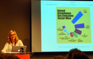
In this speak at the Future of Web Design, London 2015, we were introduced to basic concepts of data visualisation.

How to display data
The first picture we saw were some faces. The faces were connected to a database about crime statistics in the USA. The data were connected to facial parts, such as the forehead, the eyes, the mouth etc. The higher the number the bigger was the facial part.
A face with a very big forehead might indicate a high murder rate. The look of the face would tell an interestiong story about crimes the states in the USA.
How to display data
- Use visual cues.
- Use coordinate system, cake diagrams and similar.
- Use a scale with x and y axis.
- Use colors og graphical forms to signify something, e.g. male or female.
Always check your data
Here the fun began. Lisa Gringl informed us, that a pie chart always shoul ad up to 100%. The blunder samples were just amazing.
Then she said: “Never use 3d”. We saw some horrible examples of 3d visualisations. Again the blunders were funny and useless.
Wind in the USA
As an example of a well designed animation with data visualisation Lisa Gringl introduced winds in the USA. You could follow the weather all over the USA. The visualisation is quite impressive.
The toolbox
In conclusion Lisa Gringl mentioned some of the tools of the data visualizier. Pen and paper are still going strong. So is Illustrator and even spreadsheets. The visualisations should ideally:
- Tell a story.
- Either serious or funny-
- Watching the visualisation must be a benefit for the audience.
- They must target the audience.
- Make sure that the audience will understand the visualisation.
Apart from pen and paper Lisa Gringl recommended the
Here I would have loved to se a code sample from real life. In fact that was the only thing I missed in this talk: an introduction to the code behind an interactive data visualisation.
On Twitter Lisa Gringl recommended to have a look at the d3.js. Here you find a JavaScript library for data visualisation, and the code behind the creative work:
