Multimedia Design

Here are my tutorials.

  • What is the future perspectives for the HTML and CSS standards? At the Future of the Web conference Den Odell started with a definition for responsive web design, somewhat like this:

    … the website appears to have been built for that particular device.

    Odell talked about what is going to happen with HTML and CSS soon, in the future and the end goal of RWD.

    Soon

    The new specifications for HTML5.1 and CSS level 4 is in the near future. A great improvement is the pictures tag. Here a new attribute is srcset that will work in the img and picture tags.

    <picture 
        srcset="tiny.jpg 1x, larger.jpg 2x"
        src="myPicture.jpg"
        alt="Here is my picture" />

    In the CSS you will be able to use the images according to media queries. And so you can have responsive images in a more elegant way.

    But Odell states, that this is in the near future. By now some 52% of the web browsers support using pictures and images like that.

    The future

    Here Odell presented ideas for media queries, for instance a webpage might look different from country to country or even from continent to continent. The CSS might look somewhat like this:

    @media {
        continent: europe;
    }

    Perhaps the user acitity could be monitored. What if you’re jogging while on the webpage?

    @media {
        activity: jog;
    }

    Connection speed is also an important factor, so perhaps you could address the problem thus:

    @media {
        connection-speed: slow;
    }
    The end goal

    For Odell the end goal is this: the browsers must disappear. So in conclusion Odell asumes, that the GUI will:

    … apear to have been built for the user.

    From the helicopter perspective Odell’s vision is a movement from a focus on devices to focus on the user.

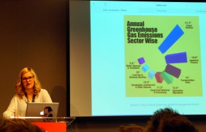
  • Lisa Gringl – Visualize Data

    In this speak at the Future of Web Design, London 2015, we were introduced to basic concepts of data visualisation.

    Don't use 3d in data visualisation!
    Don’t use 3d in data visualisation!

    How to display data

    The first picture we saw were some faces. The faces were connected to a database about crime statistics in the USA. The data were connected to facial parts, such as the forehead, the eyes, the mouth etc. The higher the number the bigger was the facial part.

    A face with a very big forehead might indicate a high murder rate. The look of the face would tell an interestiong story about crimes the states in the USA.

    How to display data

    1. Use visual cues.
    2. Use coordinate system, cake diagrams and similar.
    3. Use a scale with x and y axis.
    4. Use colors og graphical forms to signify something, e.g. male or female.

    Always check your data

    Here the fun began. Lisa Gringl informed us, that a pie chart always shoul ad up to 100%. The blunder samples were just amazing.

    Then she said: “Never use 3d”. We saw some horrible examples of 3d visualisations. Again the blunders were funny and useless.

    Wind in the USA

    As an example of a well designed animation with data visualisation Lisa Gringl introduced winds in the USA. You could follow the weather all over the USA. The visualisation is quite impressive.

    The toolbox

    In conclusion Lisa Gringl mentioned some of the tools of the data visualizier. Pen and paper are still going strong. So is Illustrator and even spreadsheets. The visualisations should ideally:

    • Tell a story.
    • Either serious or funny-
    • Watching the visualisation must be a benefit for the audience.
    • They must target the audience.
    • Make sure that the audience will understand the visualisation.

    Apart from pen and paper Lisa Gringl recommended the

    Here I would have loved to se a code sample from real life. In fact that was the only thing I missed in this talk: an introduction to the code behind an interactive data visualisation.

    On Twitter Lisa Gringl recommended to have a look at the d3.js. Here you find a JavaScript library for data visualisation, and the code behind the creative work:


  • Content Strategies


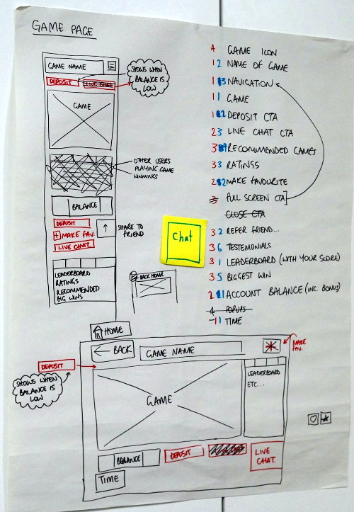
    The finished wireframe with priorities.
    The finished wireframe with priorities.

    At the Future of Web Design, London 2015, content strategist Steve Fisher presented his model for content design.

    At the Future of Web Design, London 2015, content strategist Steve Fisher presented his model for content design. Fisher introduced a two step model. But first he introduced four question for every website:

    1. What do you do?
    2. What is painfull?
    3. What do you love?
    4. What do you wish?

    His content design principles are:

    Work for a real audience

    • Users first.
    • Sustainability (that the site should be easy to maintain).
    • Accessibility for users on all devices.
    • Design for real people, not personas.

    Fisher wants to work for a real audience. That’s perhaps why he does’nt like personas. He prefers to have a real audience and to talk to real persons. Developers can asume many things, when they work with personas. Only interviews with the real audience will say whether these assumptions are correct or not.

    The design funnel should look like this:

    • The audience.
    • A UX vision.
    • Design principles.
    • Goals.

    First of all you have to prioritize the content. Some issues may be urgent important or non-urgent important. Others may be “urgent non-important” or even “non-urgent non-important”.

    Then all you must define central content. Everything on the website must be prioritized. Hay recommends to sketch out all pieces of content in order to discover the core message of the website.

    Whether the screen is small or large you have to figure the patterns.

    Prioritize

    One way to prioritize is to create a spreadsheet and then prioritize. You need some sort of content inventory – and stick it notes can be great tools for the job. Here you have to look for patterns.

    When the lists are done, they should be prioritized by importance e.g.:

    1. The standard content view.
    2. Landing pages.
    3. Product view.
    4. Application view.
    5. The homepage.

    That a homepage may come in as the 5th priority may come as a surprise. But of course it depends on the website. You have to prioritize by importance, because the users may come to the landing page before the homepage.

    View priorities

    Another way to prioritize is to work with the views. Here you write a list with all your views, and then prioritize like this:

    • One: essential. The website will not work without these views.
    • Two: great to haves.
    • Three: nice to haves (if these views were not present, the website would work anyway. Like: social sharing).
    • Four: useless (get rid of them).

    That was the starting point of the workshop. In groups we had to find a case. In our group we used an online casino as our case.

    We looked at the different views, and worked in two steps. First we put the views in the categories one, two, three and four. After that we had to prioritise the ones, the twos and so forth.

    Propose a new design

    Having sorted the information on the website we created two essential wireframes. One for mobile devices and another for larger devices.

    Responsive test tools

    After the group presentations Steve Fisher gave some valuable tips for websites for responsive testing:

    The Future

    Steve Fishers workshop was a fine introduction to content strategy. In the group we worked with a real life case about an international web casino. In the end the workshop gave some fine inputs, tools and tips about structuring content.

  • WordPress

    So you have installed _S. And from here the rest is styling. Styling WordPress can be a daunting task. Especially if you don’t know the relevant ids and classes etc. But there is hope. Have a look here:

    Rapid Prototyping – or the new workflow

  • How to display images in a theme or childtheme in WordPress.

    On Linux and perhaps some Mac systems you may have to change the owner of the folder to daemon:daemon and set chmod to 777 during development.

    When you launch the site online the file permissions must be more strict. Make sure that:

    • All directories should be 755 or 750.
    • All files should be 644 or 640. Exception: wp-config.php should be 440 or 400 to prevent other users on the server from reading it.

    Sometimes the images will not display because of user rights. On Linux and perhaps Mac you may have to set the owner to daemon and the usergroup to daemon:

    • # sudo chown -R daemon:daemon yourWordPressFolder/
    1. Create some posts. Just some text that comes to your mind.
    2. Add an image to the post.
    3. Why not share a video from YouTube.
      Tip: just paste the share link into your post. Save and see …
    4. Create a page. Adorn with videos and images you fancy.
    5. Add your page to the menu.
    6. Go to the frontend. Try out your menu.
    7. Write a post where you explain the difference between a PAGE and a POST. The intended target group is a teenager who sees WordPress for the first time.
    8. How can you add a POST to your menu?
    9. Try out the themes.
      1. Find alternative themes online.
      2. Install them.
      3. Choose one that you fancy.
    10. Upload a screendump (or screendumps) of your work to fronter. That’s the mandatory assignment for today.
  • In most projects at the Multimedia Communication and Design programme you will be asked to write an academic report following the academic standards from Harward.

    Since interaction and code has a weight of some 25% at the first and second semester and around 30% at the third semester it is natural to expect a similar weight in a report. So if you’re supposed to write say 15 pages then roughly a quarter of the pages would be ok.

    Strategy I: The Silo
    Now there are certain strategies you can follow. Old school reports tended to have divisions for each subject. So the students would write something for the business, communication, design and interaction teachers.

    Doing so is not bad at all. But the report will look a bit like four silos. And if you divide the stuff there is a tendency to focus only on the subject at hand.

    Then you may forget, at one subject is closely linked to another subject. Ideas from design will affect the code – and vice versa.

    Strategy II: The Cross-subject Report
    Another strategy is to see how the subjects are connected. Perhaps your communication leads to a persona.  She’s 25 years old and just loves webpages with pink animations of running horses.

    In that case you have ideas for the design. There will be horses. And the color pink will play an important role in your design. One way or another you will have to animate the horses.

    This again leads to the code that you have to write. Perhaps you’ll use the Jquery plug-in Spritely.

    So you draw a spritesheet in Photoshop. Yep, that’s design. And then you implement some animation code on the website. That’s interaction. Perhaps you made a sketch too. And so you have something, that could turn into interesting pages in the report. Here’s the code:

    $('#pinkHorses').sprite({fps: 12, no_of_frames: 7});

    You may imagine the pink horses and so in your mind …

    In one illustration you could have your sketch, the code needed and the result in a browser. And here you cover more than one subject in an interesting way.

    Don’t tell it – show it!
    A sound creative writing principle is “don’t tell – show”. Let your report demonstrate how you developed your idea. And how you implemented the code in the end.

    Perhaps the censor does not know anything about code. So you have to explain what your code does. It’s a bit like expaining the rules of a game to a younger sister or brother.

    In the codesample above you could explain, that:

    • The sprint was made on a sunny tuesday in march.
    • Tell that you have importet the script pinkHorses.js.
    • $(‘#pinkHorses’) is Jquery. It will select the tag with the id pinkHorses.
    • In the CSS you have styled the tag, so that you only see one of the horses in the stylesheet.
    • Basicly the plugin will move the background with 12 frames per second. The result is the illusion of moving pink horses.
    • You could discuss whether 12 fps is satisfying or not.
    • You could countinue to animation principles from the Disney studios from “Steam Boat Willie” and on.
    • And how about the sounds of the running horses … and the cute Jquery controlling the sounds.
    • By thine own ingenium invent more …

    Now you have a cross-subject line from business, communication and design to an interaction code sample.

     Third party code
    Jquery and a Jquery plug-in is third party code. Since you did not invent either Jquery or the Spritely plug-in you have to give the sources in your report.

    In the bread text of your report you may give the url to Spritely in a footnote. Do it like this:

    http://spritely.net/documentation/ (visited 16.3. 2015)

    At the end of the report you’ll have a list of sources. Here you must write all thirdparty code used. If possible sorted by author – or at least by the name of the code library.

    Harward Academic Standards
    Here is the link to the academic standards that we use at the Aarhus Business Academy. Use them because we expect you to do so.

    You link to a website like this:

    NHS Evidence, 2003. National Library of Guidelines. [online] Available at: <http://www.library.nhs.uk/guidelinesFinder> [Accessed 10 October 2009].

    So how would you write, that Jquery and Spritely was used in your academic report?

    Remember that a PDF file can handle hyperlinks. So use links in your report – and link to your product on the frontpage too.

    Conclusion
    When you write about code you have to demonstrate your powers as a coder. Don’t explain what HTML and CSS is. It’s far better to explain why your markup looks as it does.

    Perhaps you wrote some cool class in PHP, that can generate the HTML for the user. Or functions you can reuse for other animations. How are these classes and functions connected to your overall design ideas, why do the look the way they do … and could you have acheived the same thing in a better way?

    To be honest your teacher and censor love discussions and usertests. Well, this may be off topic. But even the coolest code is worth nothing if your user cannot use your product.

    To sum up:

    • Show how your code works.
    • Try to demonstrate the path from the rough sketch to the finished code.
    • Give credits to the authors of ANY third party plugins.
    • Use the Harward System.
  • The http://www.programmableweb.com/ is s vast collection of APIs for web developers. It is a fine place to start if you need some API service for your website or app.

  • On at JavaScript canvas the registration point is the top left corner.

    So in hit detection you have to calculate the x-position, the image width and height. In layout you should be able to figure out where to plage the images, and illustrations.

    • Y = “up / down”
    • X = “left / right”

    ( I tend to forget this … )

    The image registration point.
    The image registration point.
  • The x and y axis.
    The x and the y axis.


    • On the HTML canvas the top left corner is x = 0 and y = 0.
    • The y-axis is “up & down”.
    • The x-axis is “left & right”.
  • With a canvas you can animate your page. You can use images or draw geometric figures on the canvas. Here are some tutorials for canvas animation.

    Parallax Effect ( Multilayer animation )

    The following presentation is not strictly JavaScript but a sum up of a bunch of animation methods for the web:

  • APIgee - adgang til mange APIer
    APIgee – adgang til mange APIer

    The Instagram API is just one among many APIs. Here is a list of interesting sites:

    These are just a few examples ….

    Developers can access the APIs for e.g. Instagram, Twitter, Facebook, Flickr etc. ( often a developer key, token or client_id is requiered ).

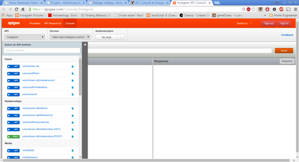
    A great portal to many APIs is APIgee – the interface is used by Instagram and many other providers of third part data.

    • Get Instagram image feeds – see my example on Instagram.
    • Method: find out how to format the URL, that will give you the wanted data.
    • As soon as your API sends a satisfying response, you can use the json parser.
    • The analysis of the json object will give you an idea of how to format strings for the AJAX script, such as:
      • data.data.link.url ( etc. )

    APIgee

    Via Instagram you can open APIgee. In the top left corner there is a drop down menu with access to many APIs. Choose one. Next to the name you’ll find a drop down menu for authentiation. Choose it. If you can work without authentiation so much the better. If not … well try to authentiate with your personal or professional user profile.

    The authentiation will give you a token. Add the token to the search string. Then you’re ready to format your jsonp searchstring urls, like this one:

    https://api.instagram.com/v1/users/261168726/followed-by?access_token=xxxxxxxxxxxxxxxxxxxxxxxxxxxxxxx

    Workshop

    In groups choose an API from a json data provider. Experiment with the API, try to get interesting results – and when you have the data you want – style it with all the arts and tricks you know from CSS and jQuery.

    After lunch present your work in plenum.

    Upload your work as a group.


Enable Notifications OK No thanks

We use cookies - more information

Multimusen.dk will set a few cookies from Doubleclick, Google and the Social Media plugins they ay set some cookies. Some of my pages use APIs - such as YouTube, LinkedIn, Google Fonts, Google Maps, Mapbox, Spotify, Jetpack, Twitter, Facebook &c.. Such plugins may set the odd cookie.

Close