Torsdag – fredag mødes ledere og undervisere på Multimediedesigneruddannelsen i Odense for at arbejde med den nye studieordning for uddannelsen.
Per's Multimedia Tutorials
Torsdag – fredag mødes ledere og undervisere på Multimediedesigneruddannelsen i Odense for at arbejde med den nye studieordning for uddannelsen.
I’m at the JsConf in Reykjavik. The venue is the fantastic Harpa, with wonderful artwork by Olafur Eliasson. We live in the hotel with the Sky Lounge just across the street.
There were several talks on JavaScriot as a creative tool. Raisa Cuevas introduced to augmented reality, and she introduced several creative tools, such as:
https://vrscout.com/news/google-arcore-ar-android/
https://github.com/google-ar/three.ar.js/tree/master
https://github.com/jeromeetienne/AR.js/blob/master/README.md
Halldór Eldjárn & Þórður Hans Baldursson introduced the code behind the interactive artwork decorating Harpa this week. On the website http://paint.jsconf.is/ you can choose the colors on the building. They told about the work, and how they wrote the creative code.
Then Kate Compton told about her work as an artist / researcher. She used JavaScript for art. Even her dress was made by JavaScript. One of her bon mots was:
“make things that makes things”
You can follow Kate’s work here: http://galaxykate.com/
Among the tools in her toolbox was https://threejs.org/
The first keynote speaker was a nodejs talk, along the lines of this: “version 1.0.4 of XX is not there yet. Please google”. My mind drifted away, but perhaps there were hidden gems for the Nodejs adepts. But at the end of the day JsConf gave many ideas for creative code.
Code is poetry.

Right now the multimedia students at Business Academy Aarhus work on their exam projects. During the project they’ll create an advanced multimedia solution for a real life client, that must be “powered by WorPress”.
Since they are creative multimedia users, they want to change a given theme either by CSS tweaks, or more advanced code, such as custom pages in PHP via the template hierarchy.
A few students have tried to create themes from scratch or very basic skeleton themes. They get the cocalled “1000 hour” headstart from Underscores.me.
In this way they had free hands for their creative visions.
Other students go for the popular freemium-premium themes with lots of built in drag and drop options. Such themes are very popular in the business, so working with them is a fine preparation for the life and art of the web designer. But if you think that this choice is cheating or a short cut, think again.
Indeed, some of these self-proclaimed “professional” themes play nasty tricks on the web developer. Basic WordPress functionality, such as custom CSS or other standard WordPress functionality is blocked by some themes!
Often the code in “fremium-premium” solutions is quite hard to understand. Not because the code is more “professional”, but because the developers want to protect whatever they think is a “business secret”. The business model is obvious – if you can’t figure out how to use the “free” theme you have to pay … and that’s what I’d call a booby trap!
Perhaps the beginner should avoid such themes. You may think that you buy support, but in the real world you just pay for more problems! And yeah, you could pay in order to solve these problems too …
So the multimedia designers who used the “professional” themes had to work very hard in order to create the solutions with the tweaks they envisioned.
Often what seem to be the “easy way” or “professional solution” isn’t. Like at all. Most web developers would be better off with a standard no fuzzz theme like the core WordPress Theme Twenty Seventeen, or one of the free themes in the WordPress repositories.
If you want to design posts and pages via drag and drop, perhaps it’s the best choice is to use a standard theme with a good clean and easy readable code, and then add something like Siteorigin’s Pagebuilder to the theme.
At the end of the day you could say that it’s a daunting task to create a WordPress theme from scratch. But when I see the efforts the developers face when fighting with the freemium-premium solutions I have to conclude, that these themes is no shortcut at all.

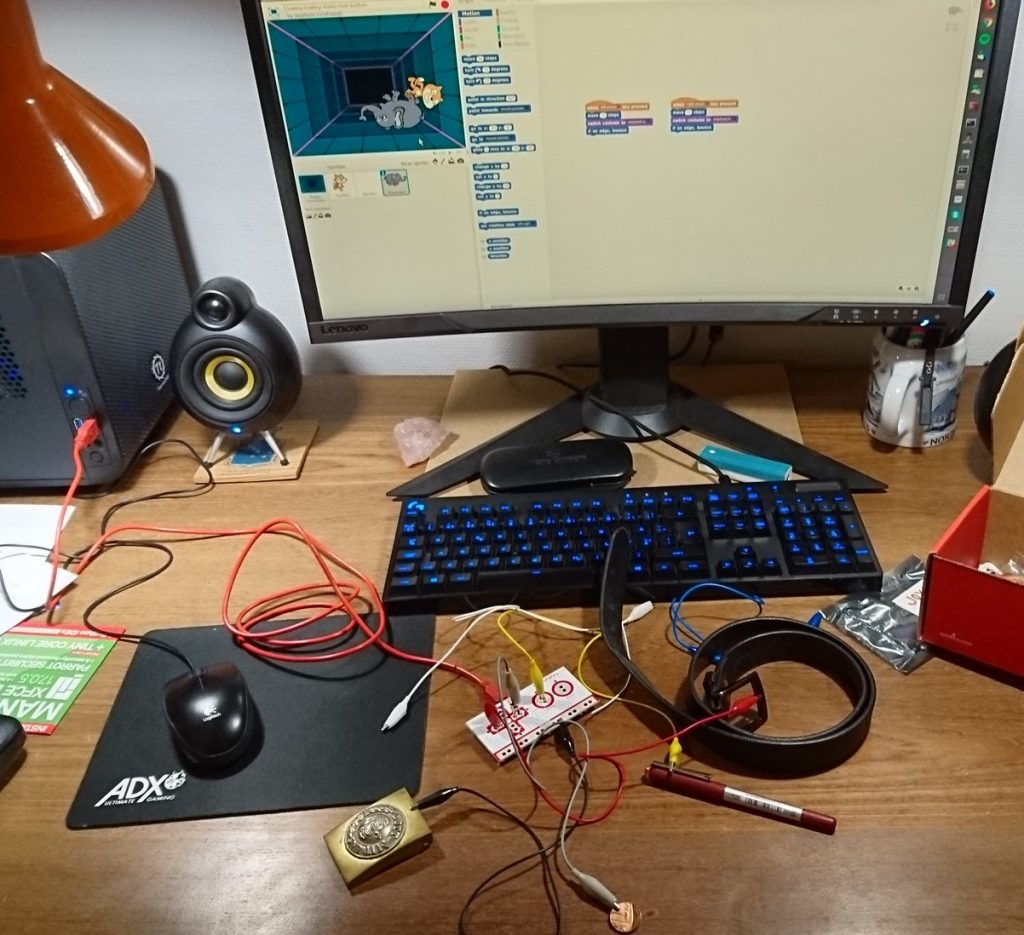
Makey-Makey is basicly a keyboard. The bottom bar is ground, and the others are “keys”. You can use anything that’s conductive as a key. Even fruits, water or your partner.
Here’s a short and handy tutorial about the Siteorigin PageBuilder. In Pagebuilder each row will get an id. Then each row will get an id in the Pagebuilder settings.
Now the video does not tell this, but I guess that Pagebuilder will set bookmarks on the webpage, as in:
<h2 id="row-about-us">About us ...</h2>
In the WordPress menu the internal links will be used. The menu will link to #row-about-us, and Pagebuilder will create markup somewhat like in this sample:
<a href="#row-about-us">About us</a>
Now onepagers tend to scroll in a cool slow way. You can do this via some JavaScript. I guess there’s a plugin for it too.
Now you have a very basic theme. There is a menu, but it’s horrible, or so it seems. In fact you’ve got a dropdown menu – so that’s kind of a head start. And that’s the idea of Underscores. From here it’s a matter of styling, but where are the files we need?
Have a look in the style.css file. Here your theme name and author is defined. Add your name and the URI to the website, or even better to your Github repository. Since you’re working on a home hacked theme, you may do stupid things. So enter your credentials e.g. (see my sample style.css here):
Theme Name: Abracadabra
Theme URI: https://github.com/asathoor/underscores-and-sass
Author: Per Thykjaer Jensen and Underscores.me
Author URI: https://multimusen.dk
Description: The 2017/18 theme for WordPress based on Underscores. Features: SASS, Gulp, Bower, Font Awesome, jQuery.
Version: 0.5
License: GNU General Public License v2 or later
License URI: https://www.gnu.org/licenses/gpl-2.0.html
Text Domain: petj-17
Tags: custom-background, custom-logo, custom-menu, featured-images, threaded-comments, translation-ready, responsive, two-columns, custom-header-image
Since Michael Heileman designed the Kubrick theme in 2004 the standard blog design became something like a sandwhich with a header and footer as the buns. Between the header and footer you’d see some content and a sidebar. So the blog designer could choose between content-sidebar or sidebar-content. Of course you don’t have to do this, but the standard WordPress design still use the magick formula: header.php, footer.php, sidebar.php – and a filename. If there are no other files, WordPress will use index.php as a fallback. All of these files are found among the Underscores files.
Underscores made it easy to create a basic design, with content and a sidebar to the right or left of the content.
In the folder layouts you’ll find two files with the CSS for the basic layout:
So if you want a classic blog layout, you can copy-paste the content of the one you fancy to style.css. Here is the CSS from content-sidebar.css:
.content-area {
 float: left;
 margin: 0 -25% 0 0;
 width: 100%;
}
.site-main {
 margin: 0 25% 0 0;
}
.site-content .widget-area {
 float: right;
 overflow: hidden;
 width: 25%;
}
.site-footer {
 clear: both;
 width: 100%;
}
Now you have a traditional blog design.
Of course these styles are not responsive at all. You still have to refine your design with media queries and so on. Since the CSS in media queries are quite redundant a SASS mixin may come in handy (see this sample).
@media screen and (min-width: 100px) and (max-width: 760px) {
 @include responsive(); // sidebar to bottom
 body {
 font-size: 123%;
 }
}
The Underscores theme does not support a custom header image. Many themes give you this option, so how do you implement the feature? First you have to add this to the functions.php file:
$args = array(
 'flex-width' => true,
 'flex-height' => true,
 'default-image' => get_template_directory_uri() . '/images/clouds.jpg',
);
add_theme_support( 'custom-header', $args );
Then open the header.php file, and add the following where you want the image to appear:
<img src="<?php header_image(); ?>" height="<?php echo get_custom_header()->height; ?>" width="<?php echo get_custom_header()->width; ?>" alt="">
From now on the user is able to choose his own header images from the media. This short sample also demonstrates, that you can edit any file in the theme.
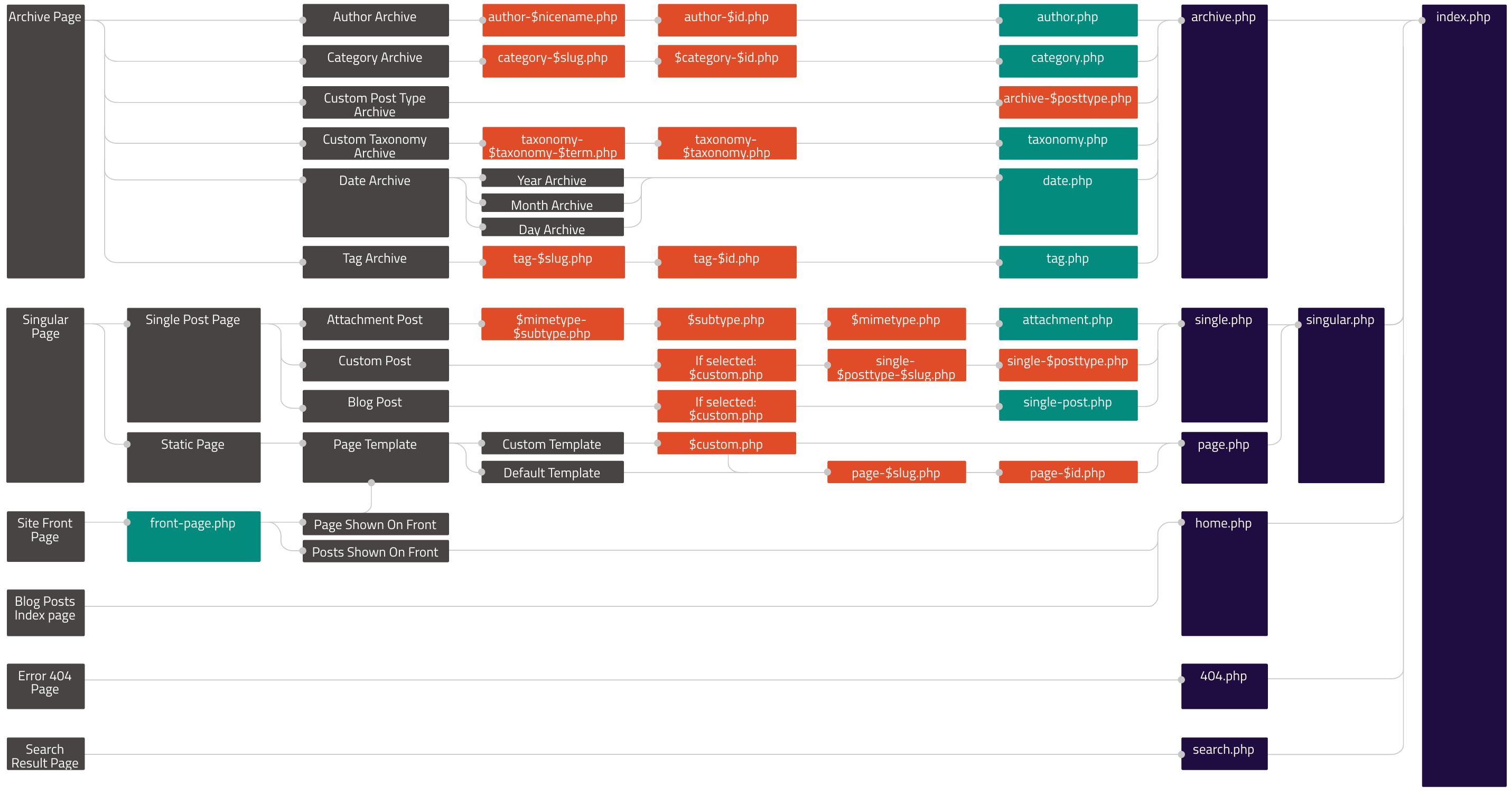
In WordPress custom pages have to follow a certain naming convention. You can see the system in the template hierarchy.

Let’s say that you want a custom design on the front page. In the template hierarchy you can see that the WordPress will look for the frontpage code in the file front-page.php.
I’d like to design my frontpage in Siteorigin’s PageBuilder. So I need a frontpage that does not interfer with Pagebuilder. And I don’t want a headline. A fast head start is to copy a file and use it as a model. Remove what you don’t want. Add what you need. In this case the result was extremely simple:
get_header(); ?>

<div id="primary" class="content-area">
 <main id="main" class="site-main">
 <?php
 // the loop
 while ( have_posts() ) : the_post();
 get_template_part( 'template-parts/content', 'frontpage' );

 endwhile; // End of the loop.
 ?>

</main><!-- #main -->
 </div><!-- #primary -->

<?php
//get_sidebar();
get_footer();
The loop will get template parts from the file ../template-parts/content-frontpage.php. Here is the loop part for the full width PageBuilder content:
 <article id="post-<?php the_ID(); ?>" <?php post_class(); ?>>
    <?php the_content(); ?>
 </article><!-- #post-<?php the_ID(); ?> -->
This part of the loop will print the content, but not the headline. If you want the headline feel free to add the_header() and similar loop tags (see this article).
With Underscores you’ll learn what it takes to create a WordPress theme almost from scratch. Underscores is the basis of many themes – among them the core WordPress theme Twenty Eleven.
The _S (Underscores) theme is a wonderful tool, if you want to create a WordPress theme from scratch. Here SASS really shines, because you can create a mixin, and pass whatever numbers or settings that are needed. It’s as easy as this:
// tablets: iPads and friends
@media only screen and (max-width: 768px) {
    @include responsive(700px,400px,300px,1.1em);
}

// mobile
@media only screen and (max-width: 598px) {
    @include responsive(500px,500px,500px,20px);
}
And so on – in this way you can define the width of any HTML element. The SASS code for this particular mixin is:
@mixin responsive(
    $page,
    $primary,
    $aside,
    $siteTitle
 ) {

#page {
 background-color: #fff;
 max-width: $page;
 margin: auto;
 }

 // "wrapper" content container
 #content {
 @include flexbox(); // prefixes for browsers
 display: flex;
 flex-wrap: wrap;
 }

 // content
 #primary {
 width: $primary;
 max-width: 100%;
 }

 // sidebar, widgets
 aside {
 width: $aside;
 max-width: 100%;
 }

 // site title size
 .site-title {
 a {
 font-size: $siteTitle;
 }
 }

 // images and media
 img,
 iframe,
 .entry-footer,
 .entry-content,
 .entry-header,
 .entry-footer,
 .site-branding,
 .site.title,
 #mast-head {
 max-width: 100%;
 }
} // end responsive mixin
Perhaps you feel that the mixin code is long. But on the other hand, you only have to write this code once. From now on you can pass variables to the responsive design in just one line:
.someClass { @include responsive(980px,500px,420px); }
Q.E.D.
So this is Christmas
And what have you done
Another year over
And a new one just begun.
John Lennon
Xmas is a wonderful excuse for bad taste – here’s the new Xmas theme on Multimusen. It’s not completely finished yet. For now it’s just a big screen thing. So if you’re on a mobile device, you’re probably lost.
Status “WordPress in the Classroom” : 2181 visitors, 290 downloads, avg. 9,8 pages seen per visit. Sources: Facebook, LinkedIn, WordPress.

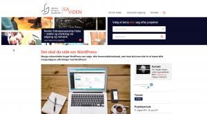
Eaviden.dk has published a page about my research project “What You Should know about WordPress”. Eaviden is a web portal presenting the research and innovation activities on the Danish business academies.
On the page you find a description of the project, and links to my research blog (you’re reading it now). The text is in danish.
Here is the link to my project:
http://www.eaviden.dk/project/det-skal-du-vide-om-wordpress/
Imaginary maps: Tolkien
If you’re teaching WordPress in school, or know somebody who does, here’s a free eBook on everything WordPress: https://t.co/5QIMIy0txj by @pertjensen
— Smashing Magazine (@smashingmag) November 4, 2017
Vitaly Friedman and the Smashing Magazine kindly shared the link to my eBook on Twitter. Smashing Magazine is always a great source of inspiration on everything about coding, design, graphics and UX trends.
We use cookies - more information
Multimusen.dk will set a few cookies from Doubleclick, Google and the Social Media plugins they ay set some cookies. Some of my pages use APIs - such as YouTube, LinkedIn, Google Fonts, Google Maps, Mapbox, Spotify, Jetpack, Twitter, Facebook &c.. Such plugins may set the odd cookie.