Content Strategies

At the Future of Web Design, London 2015, content strategist Steve Fisher presented his model for content design.
At the Future of Web Design, London 2015, content strategist Steve Fisher presented his model for content design. Fisher introduced a two step model. But first he introduced four question for every website:
- What do you do?
- What is painfull?
- What do you love?
- What do you wish?
His content design principles are:
Work for a real audience
- Users first.
- Sustainability (that the site should be easy to maintain).
- Accessibility for users on all devices.
- Design for real people, not personas.
Fisher wants to work for a real audience. That’s perhaps why he does’nt like personas. He prefers to have a real audience and to talk to real persons. Developers can asume many things, when they work with personas. Only interviews with the real audience will say whether these assumptions are correct or not.
The design funnel should look like this:
- The audience.
- A UX vision.
- Design principles.
- Goals.
First of all you have to prioritize the content. Some issues may be urgent important or non-urgent important. Others may be “urgent non-important” or even “non-urgent non-important”.
Then all you must define central content. Everything on the website must be prioritized. Hay recommends to sketch out all pieces of content in order to discover the core message of the website.
Whether the screen is small or large you have to figure the patterns.
Prioritize
One way to prioritize is to create a spreadsheet and then prioritize. You need some sort of content inventory – and stick it notes can be great tools for the job. Here you have to look for patterns.
When the lists are done, they should be prioritized by importance e.g.:
- The standard content view.
- Landing pages.
- Product view.
- Application view.
- The homepage.
That a homepage may come in as the 5th priority may come as a surprise. But of course it depends on the website. You have to prioritize by importance, because the users may come to the landing page before the homepage.
View priorities
Another way to prioritize is to work with the views. Here you write a list with all your views, and then prioritize like this:
- One: essential. The website will not work without these views.
- Two: great to haves.
- Three: nice to haves (if these views were not present, the website would work anyway. Like: social sharing).
- Four: useless (get rid of them).
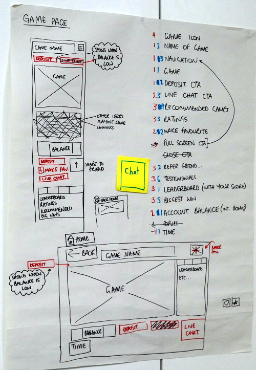
That was the starting point of the workshop. In groups we had to find a case. In our group we used an online casino as our case.
We looked at the different views, and worked in two steps. First we put the views in the categories one, two, three and four. After that we had to prioritise the ones, the twos and so forth.
Propose a new design
Having sorted the information on the website we created two essential wireframes. One for mobile devices and another for larger devices.
Responsive test tools
After the group presentations Steve Fisher gave some valuable tips for websites for responsive testing:
The Future
Steve Fishers workshop was a fine introduction to content strategy. In the group we worked with a real life case about an international web casino. In the end the workshop gave some fine inputs, tools and tips about structuring content.
