Thoth.dk CheatSheet
How to use the WP block editor when you edit the entire site layout or the actual content.
From Style Tile to WordPress
As a designer you often start out with a Style tile, a Figma or similar.
How can you transfer the “LoFi” ideas from your style tile to the “HiFi” WordPress theme?

The Styles
Before your work in WordPress you will probably have a Style Tile, a Figma or something similar. Above you see a typical style tile from Opendesignkit.org. The question is: how do we get from the rough design idea to a WordPress solution.
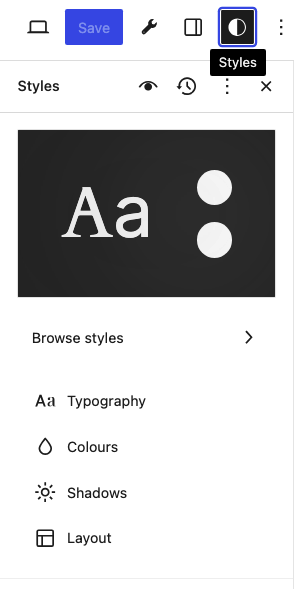
- Open Appearance > Editor > Styles
- Click the pencil logo
- In the right column this dialog will open:
Typography
In the dialog click “Typography”.
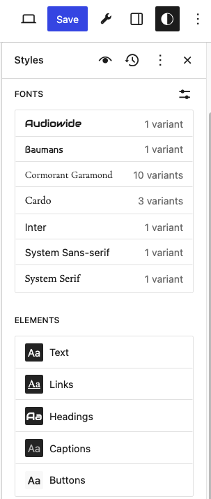
Now you can enter the colors, fonts, &c. from Figma or your Style Tile to relevant design elements. If the font you need is not available for the theme, you can add more fonts from Google Fonts, or fonts that you upload.
Colors
From your Style Tile or Figma you can add the colors where you want them to appear.

As you can see we add the colors to the text, background, links, captions, buttons and headings here. If the colors you need are not present, then you can add them in the palette.
If you open the Stylebook you can edit any block in the editor.
Exercise: Develop your Stylebook
Use your Style Tile / Figma and add the relevant colors and fonts to your theme. If the fonts you need are not present in the theme add them – or perhaps a substitute font from Google fonts, that looks like the one you had in Figma og the Style Tile.
- Change the fonts to something similar to the fonts in your Style Tile / Figma.
- Assign the correct fonts in text, links, headings, captions and buttons.
- Colors: edit the palette, so that the colors from your Style Tile / Figma are present.
- Assign colors to text, background, links, captions, buttons and headings.
- Open the stylebook and edit all blocks so that the main ideas from your Style Tile / Figma become part of your design.
- Develop your stylebook so that the content will look similar to the elements from your Figma / Stylebook.
Sometimes you need to add extra CSS, scripts or HTML. Here I recomend that you install the plugin Simple Custom CSS & Js. Then you’ll be able to add custom code.
When you are satisfied you can go on create real content. You can allways return to the Stylebook and make changes.
Theme Handbook
This tutorial will link to WordPress features. Of course the first button will link to the official documentation.
Layout with the Block Builder
The Grid Block

The Grid block is a new feature (2024). By the Grid Block you can create galleries in a “Flexbox wrap” style. Here’s a sample grid block:





About the Block Editor
Everything in WP is designed and created in the block editor. In the editor you can create:
- Templates will define the layout.
- One template can be assigned to many pages and posts.
- Templates that will define the look and feel of all pages, posts.
- Templates for the index and special pages like 404.
- Templates for the frontpage.
- Content for pages and posts.
- Patterns, like: headers, footers and special patterns.
What is a Block?
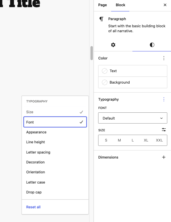
In Atomic Design we would say that a single block, like a h1-heading or a paragraph is an “atom”. A paragraph is an object with attributes like the color of text and background, font-family, fontsize and more. Of course you can style each and every paragraph – but in the long run that’s cumbersome.
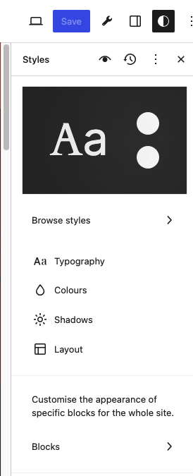
The smart approach is to define the look and feel of all the paragraphs. You can do this in Appearance > Editor > Style. Here you can define the look of all paragraphs.
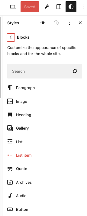
Now click on Blocks, and find Paragraph in the list:

Click on the block – now you can define the typical settings of any paragraph in your theme.

Now you can edit the look and feel of all the paragraphs.
Under Advanced you can add “Additional CSS Classes”. When you have these classes you can add whatever CSS you want to.
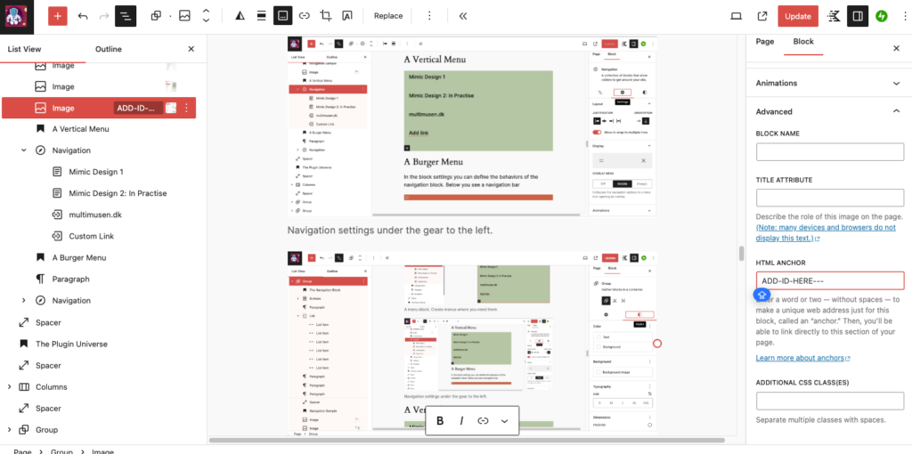
You can also add a “HTML Anchor”. In practise this is an Id that you can use in a one-pager navigation situation. If the anchor i called Clemens, you’ll add this custom link to a menu item, a link or a button:
#Clemens
The Stylebook
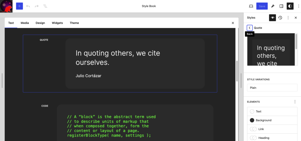
A nice shortcut in order to edit any of the blocks is the Stylebook. Click on the Eye icon, and click on the block that you want to change.
Templates
What is a Template?

Behind every block page or post there is a template. Several pages or posts can use the same template. Here is sort of a parallel to CSS files.
The content and presentation layers must be separated. The template must define where you want to see something.
If you want to work free and experimentatl it’s a good idea to use a blank canvas. Make your blank template in the Template Editor.
- Create a new layout in a blank template
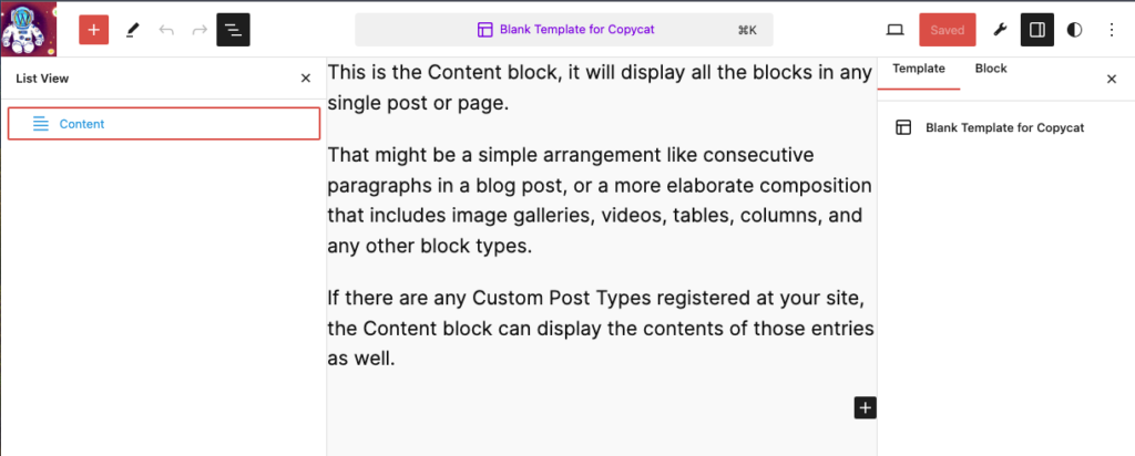
The only block on a blank template is Content. And that’s why you can see the content …
If you need to filter content or create a more advanced content section the query loop should be used.
Edit Templates
- If you open > Apearance > Edit
- > Templates
You’ll see this dialog with the present templates in the theme.
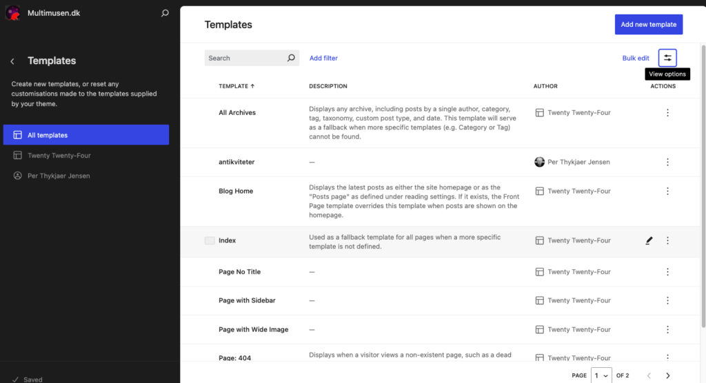
Here you can edit the templates or create new ones. Note that we see some of the standard templates here:
- Index – this is the fall back standard design of any page.
- Blog home – what your blog page will look like.
- Page 404 – the error or “not found page”
WordPress has several standard templates. Knowing them is the key to a good design in WP.
Exercise: Create a Blank Template
First create a new template with just one block in it: content. So we have no headers, footers or anything. If you create one or more new pages and assign this template to it, you’ll have a blank canvas. Which is nice for a designer.
Create a page or post. In the settings column to the right under Page click on template. Now select the blank template for your page.
You can use this blank tempate on any page or post that you want.

Block: Cover
Image in full screen width and height
For heroimages and similar – use a cover block!
You can use the cover block for hero images and text over any image. For example when you use the vh option for the height, a full browser window hero image is made by a vh = 100 and a width 100%.
That’s how this cover image is made.
- Width: 100%
- Height: 100vh
Block: Cover – video background
- Upload your video to the Media Library.
- When you add “Media” select your video.
Layout
In the editor you can create any layout by blocks that will stack, row, grop or create columns.
Add Whitespace
Add whitespace by the Spacer block. You can also add whitespace via padding and margin settings in the different blocks.


Rows, Stacks and Columns
Row:
Stack
The columns are made by the column block. Should you need another row, just add one more column block. In this case I’ve used a two column row followed by a three column row.
Below a row with a stack inside:
You can also use blocks like row and stack in order to place things in a flexbox flex or block.
Text overlay
Style Images
There are many creative options in the Image Settings. Add: borders or rounded effects.
Add a Gallery
You can add a gallery by the gallery block.
Kadence blocks will give you more options.


The Navigation Block
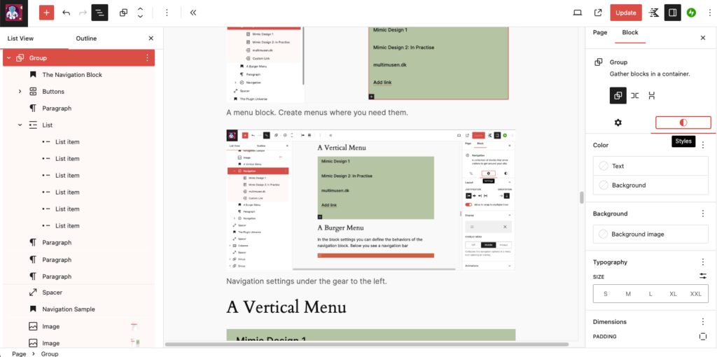
Perhaps this block is the hardest to master. Be patient here, and follow the instructions. However, the navigation block is one of the most important blocks to master. Navigation blocks can link to:
- a Page
- a Post
- a Category / tag
- a URL
- Onepager navigation to elements with named anchors
- Social Media (icons are built in here, a cool feature)
- etc.
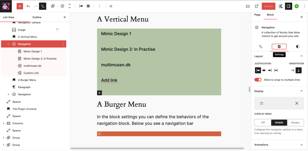
Create several menus in the Navigation section under appearance. You can create vertical and horisontal oriented menus. The page must exist before you can add it to the menu.
The navigation block is not just for headers in template parts or for the header section.
You can create navigation menus anywhere on template, a post or a page.
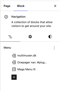
A Vertical Menu
A Horizontal Menu (Burger Only)
In the block settings you can define the behaviors of the navigation block. Below you see a navigation bar:
How to use the Navigation Block

Fonts
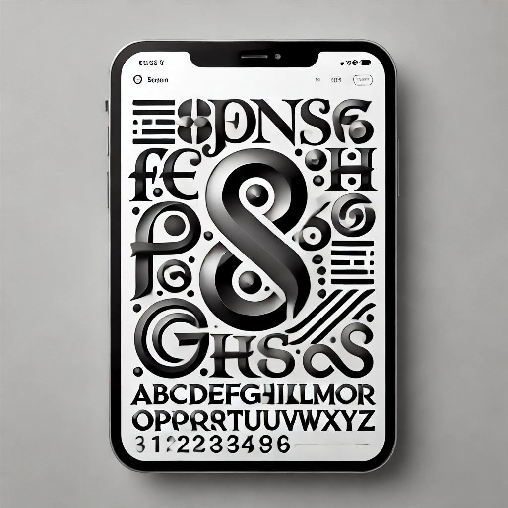
Fonts will sort of set the tone of voice of your solution. Selecting the correct fonts is one of the major design tasks. You’ll have to select two – three major fonts. Then you can assign the fonts to the different blocks in the style editor of WP.
Get Cool Fonts
A new and most wanted feature was added during the summer ’24. Integration with Google fonts. You can also upload your own fonts. Now you can use virtually any font you fancy.
Font Plugins
- Kadence Blocks
- Font Awesome
- Simple Custom CSS and JavaScript
Custom Code
In all projects at the Multimedia Design Programme you have to demonstrate your ability to add custom code.
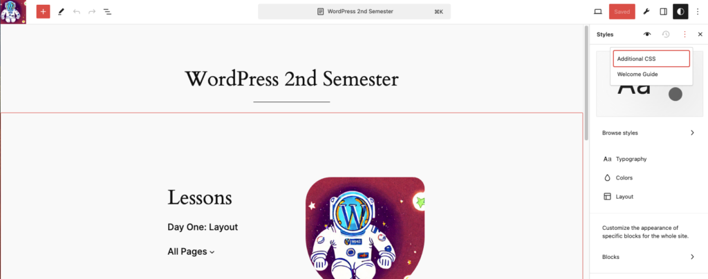
Under Appearance > Editor > Styles you can add additional CSS to your theme. This is the most easy way if you just need a little extra CSS. You can also edit the look and feel of the typography, headings, links – and indeed all the blocks in Gutenberg.
Style any Block
Gutenbergs components can be styled in many ways.
Block: Custom HTML
If you know how to do certain things in ordinary web code, then use the Custom HTML block. Here you may add elements, and even styles and scripts. By this block you can implement any code or script in WordPress.
Always use this order:
- Styles
- HTML
- Script
<style>
  h2 { color:red; }
</style>
<article>
  <h2> Hello World! </h2>
</article>
<script>
   console.log("JavaScript is up and running")
</script>
How to Integrate APIs
Maps, videos, or something stunning from a CodePen
Sample A) Spotify Share
Via the HTML block you can share maps, playlists, etc. in an iframe. Many online services and Social Media have share buttons, where you can <iframe> or similar markup.
Here is a Spotify sample – the iconic album “Ziggy Stardust” by David Bowie.
<iframe style="border-radius:12px" src="https://open.spotify.com/embed/album/48D1hRORqJq52qsnUYZX56?utm_source=generator" width="100%" height="600" frameBorder="0" allowfullscreen="" allow="autoplay; clipboard-write; encrypted-media; fullscreen; picture-in-picture" loading="lazy"></iframe>Sample B) Maps
Here it’s an iframe from OpenStreetMaps, but you can share Google’s maps too. If you want a marker on the map, just add is by a search on the map – and then share the map.
<iframe width="90%" height="350" src="https://www.openstreetmap.org/export/embed.html?bbox=10.147716701030733%2C56.11615146699165%2C10.151954591274261%2C56.11780231047794&layer=mapnik" style="border: 1px solid black"></iframe><br/><small><a href="https://www.openstreetmap.org/#map=19/56.11698/10.14983">View Larger Map</a></small>View Larger Map
Design Patterns
Are patterns the same as components?
The short answer is yes. Any block is a component. In the parlé of Atomic Design a WP pattern is a molecule.
- Create your own patterns
- Use online patterns
- This card is a pattern
- You can save such components as template parts in the Full Site Editor

Proudly powered by WordPress
